


Gotta agree with Michael. Until he mentioned it, I thought the “new post” was just another way to reply, not post a new thread. Either a different name and/or a reply button next to it would clear up the confusion.
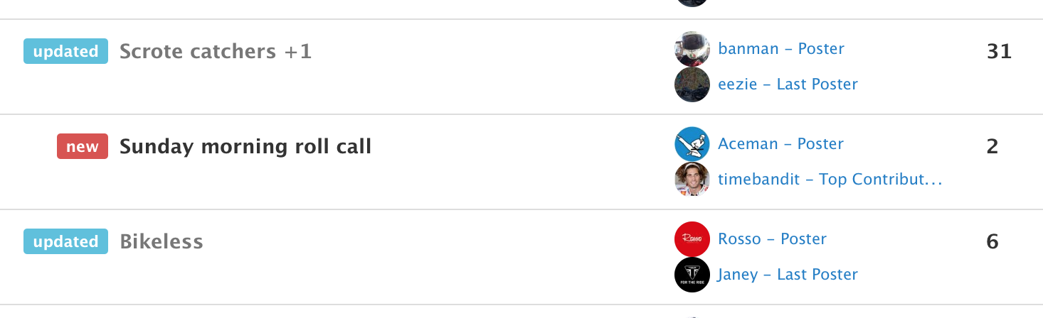
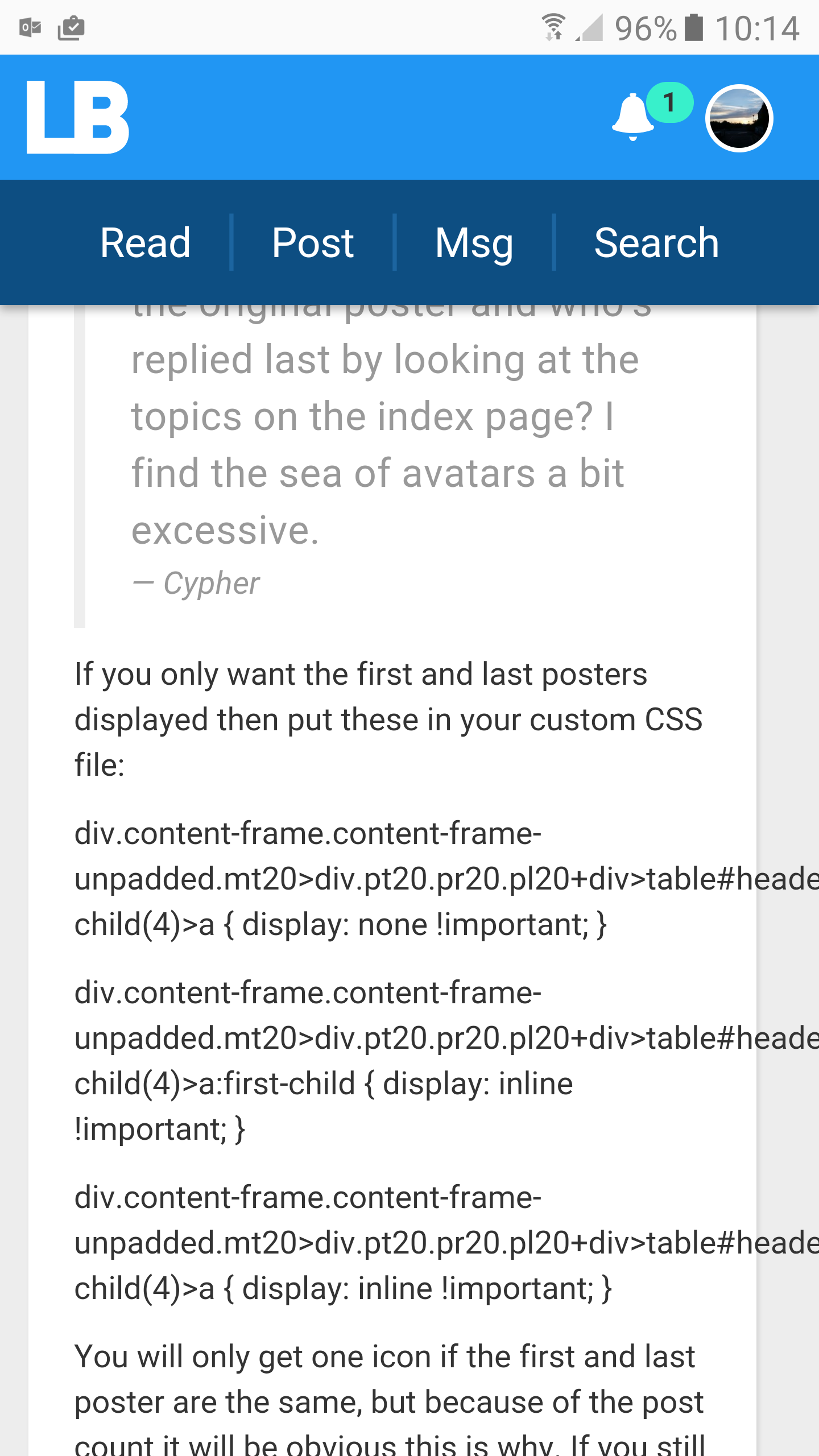
Is there a way to tell who’s the original poster and who’s replied last by looking at the topics on the index page? I find the sea of avatars a bit excessive.
Also, I liked it better when the top icons were left aligned and not right as now. Have to move my mouse too far on my widescreen monitor 
I really like the avatars…wish it would go back to red though
Cypher, hover over the circles. The first is always the original poster and the rest are the top contributors. The last poster will be mentioned in there too.
TimR, that URL issue should be fixed now.
Good work on the ‘new topic’ button, Jay. A better compromise between all and nothing.
Is there a way to tell who's the original poster and who's replied last by looking at the topics on the index page? I find the sea of avatars a bit excessive. Cypher
If you only want the first and last posters displayed then put these in your custom CSS file:
div.content-frame.content-frame-unpadded.mt20>div.pt20.pr20.pl20+div > table#headers.table.mt10>tbody>tr>td:nth-child(4) > a { display: none !important; }
div.content-frame.content-frame-unpadded.mt20>div.pt20.pr20.pl20+div > table#headers.table.mt10>tbody>tr>td:nth-child(4) > a:first-child { display: inline !important; }
div.content-frame.content-frame-unpadded.mt20>div.pt20.pr20.pl20+div > table#headers.table.mt10>tbody>tr>td:nth-child(4) > a[title$=“Last Poster”] { display: inline !important; }
You will only get one icon if the first and last poster are the same, but because of the post count it will be obvious this is why. If you still want all the other top poster icons displayed you could instead use the rules to change the format to mark out the relevant icons.
Personally I much prefer text (for one thing, most of the avatars at that size are indistinguishable) so I have the titles displayed, with first and last poster on separate lines as below. Just a shame CSS does not let you filter out the description after the username.
Attachments
Jay, loving the new tweaks. Took a bit of getting used to but it works well.
One thing I’ve noticed (it happened before as well) is that on threads that are pic heavy, it doesn’t take you to the latest post. Perhaps it calculates where the latest post is on the page and then loads the pics, which push the post further down the page?
I hope that makes sense… it did in my head.
Thanks Von.
Yeah, I’ve seen that behaviour. I’ll have another look, but this was meant to be something we resolved. It’s due to the site being ready to take you to the first unread post, but because of images that need to load in, the page has to wait before it can take you to the post. I’ll see what’s up.
Hopefully that’s fixed.
Hopefully that's fixed. Jay
So far so good. “Riveting” thread was always dropping me in the middle instead of the last post, but not anymore.
Thanks Jay, that was really quick. Seems to be fixed now, mate.
In Safari 9.1.3 (9537.86.7.8) on OS X 10.9.5 it does not go anywhere now if the page has a photo on it, it just stays at the top.
I am not sure if it is worth bothering about if it works for everyone else as it is an older browser now (due to the older OS), and I was already used to having to manually scroll anyway so it makes no difference to me. Thought I would mention it though for reference.
Mmmm, no, I’ve just seen that on Win10/Chrome as well Michael. I’ll have another look.
What page was it?
Okay, re-implemented this feature, so hopefully it’s finally fixed.
I used ht mobile app last night. first time since the update!
LOVE IT!
way much better… Cheers Jay (see not always moany)
Yay, thanks
Micheals post above doing the same
Also noticed i cannot quote the first post in a thread but subsequent posts are fine
Attachments
Mmm, can’t do much about that. Very long words are unusual. If I make a change to wrap those lines, it’ll start wrapping all words by breaking them in the middle, which obviously we don’t want. Ideally Michael would stop posting things like this and just enjoy it for what it is, but who am I stand in the way of tinkers? :)
But it is a way to relive MySpace all over again!
Thanks for fixing the scrolling, that is working perfectly for me too now.