Yea, like anything worthy of consideration can be created within a couple of days :doze:
Nice that some parameters are being set though.
G…
Less Commenty commenty more designy designy…

What ever G.
Get that imaginative cell of yours working and stop bitching
best effort so far ![]()
smiled.
i am also very happy that the swear filter ignored fuckers on pj’s post…
smiled.
+2
What new logo?
is there a thread showing this new logo somewhere?
go to the STICKERS thread
just updated the first thread
smiled.
The more I look at the new one, and particularly seeing it smaller in MacP and PJ’s avatar boxy thing, I actually quite like it.
I will try and give this a go and come up with some designs but hope the deadline isn’t too tight! Will need a few days on this ideally…
Anyway…
Here are some tips for your designs (As per PJ)
(If I have taken liberty here mods please alter to your taste)
- Your logo should work (be readable, recognisable) as small as a few centimetres, right up to billboard size.
- If it uses colour, make sure it works in black and white too. This is for newspaper print, advertising, or for use on clothing.
- Your logo can be a logotype (this is a creative use of type without imagery). There are lots of examples - just look down your local high street.
- Don’t worry if it’s rough, it’s the idea that counts and the artwork can always be tidied up on production.
- I often design logos with a friend(s), it’s a good idea to sit in a pub with your crayons and get creative. It’s surprising how the designs progress

- Don’t get too complicated or clever. Simple is often the key. Look at some famous logos/branding around you and see how they have managed it. Even just a nice typeface can work wonders.
Hope that helps, have fun…
This design is also proven to work on clothes, flags, cars, bikes, houses, planes, everywhere basically :w00t: ![]()
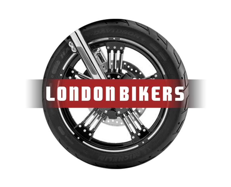
This is the first one I have come up with.
Playing on the fairly obvious really and with a similar skyline as the current one if need be.
BTW, it’s a '99-'02 R6.
Attachments


I like it G.
However, I would say this, if you look at the original that smiled has now posted in this thread, in the actual “design” part of the logo, you can’t even see “LondonBikers.com.” It is too small really.
I would suggest that yours would look a lot better if you removed the Bikers.com from the image.
Just leaving a bike with two wheels spelling out London, which I think is quite a nice touch. Not entirely sure I agree with the colours, but I expect you could change them to suit tastes.
You could write www.londonbikers.com underneath the Logo, for actually advertising the site, leaving the overall design much cleaner looking and therefore in my opinion bolder.
^^ not bad
is it just me or NumNum has just drawn something really rude and got away with it? :laugh:
silveR6 (07/07/2012)
^^ not bad
is it just me or NumNum has just drawn something really rude and got away with it? :laugh:
The thought crossed my mind that he had been doing far too much bum sex lately, and that was entirely Freudian slippage.
I quite like Garret’s effort also - but without the ‘.com’ and am not sure about the maroon colour. I also quite like Shane’s initial logo at the start of the thread - but the blue and black clash. So both logo’s could work well - but with contrasting colours to make the design more fluid and visible.
Good effort G
Got to say though that I don’t think the design would work on both stickers and clothing. Also if you look at the space the current banner logo fits in then the it may be the design won’t fit.
Could you try other colours too? Not a fan of red so much - we’re looking to refresh the site and as with the last logo change move from the one overall colour to another


