


Like it!
Great work there guys, wish i could do some of that… love the london silhouette, some sort of veriation on that would look great… think i may have a go tomorow… up your sister is good however think it may exclude any ladies who are members ???
Whatever i am sure a great design will be the outcome of all the brainstorming
What about a bike jumping over some/a double decker bus? or is that ****e?
Did you watch ‘The Great Escape’ this weekend, by any chance, Mr Gee? ![]()
I have it that most people, male or female, have a grudge against their sister… heh
nah, its too racey for ‘this’ environment, but on a t’ shirt would be cool…
btw, I am only using cheesey punch lines as I don’t know what has already been set… so just having a laugh while doing these… don’t take them as serious propositions…
Yeah, I did Jay!..and i loved every minute of it!
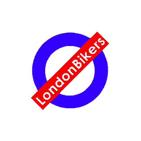
That tube map idea is FECKIN SUPERB!!! Maybe not for a logo but as a T-Shirt, then I want one and reckon it should be at the top of Jays list. Instantly recognisable, but no doubt some legality against LB using it.
Some legality? How about a huge copyright infringement one? Doh! Yes, it’s a great idea, but sadly, not usable. Copyright infringement charges are expensive, very expensive.
ermm, nice logo, just missing the TFL font (New Johnston)
I work for TFL, and I know that they would not allow it, for one the whole Intelectual property thing and it does look like an official TFL department.
Swaffs
indeed.
I’m a bit busy at the moment to get my photoshop fired up. Howabout mixing the theme, with a london outline in the background instead of the roundel and then a ‘london bikers’ bar across it?
I like roundels, and I don’t believe the concept can be copyrighted (both a good and bad situation, potentially), due to its common application. Hrm, food for thought Swaffs, thanks! Roundels also look good when emblazoned on the size of things, i.e. bikes… smart…
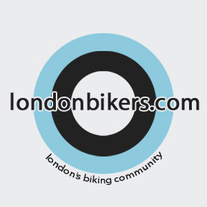
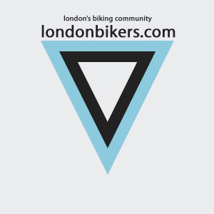
Okay, I made some time tonight to have a little rethink, and came up with these. My favourite is the right-way-up triangle version. I’m not sure how cheeky the roundel version is, I did start out just intending it to be a roundel, but I must admit, it looks similar to the London Underground logo.
Attachments
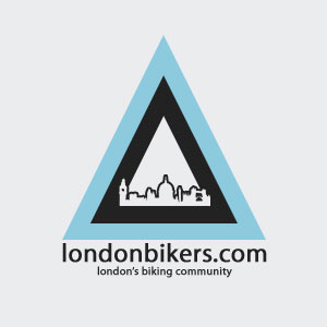
I like the right way up triangle too.
nice…
I like the round one.
I’m still not sure about the L of London in lowercase though ![]()
I like the round one you have done jay, colours are cool too!
Great designs Jay… I like the bottom triangle, Maybe with a crash helmet above the skyline?? Just a thought…
Swaffs, a capitalised ‘L’ stands out too much, throws it all out of balance. I think it’s acceptable to forgo grammar in this instance, though I’ll do some more work tonight and see if it can be incorporated. Foxy, good idea, I’ll have a play.
I like both the round one, and triangular one, though the round one needs more work I feel.
I have to say I prefer the tube logo thing, as it just shouts London to anybody. You do see that logo on t-shirts and bags and all kind of other tat, often with just any kind of message, so either people do get permission to use it or just use it anyway. I’m not suggesting the latter, but might be worth asking TfL if this would be possible for our purposes. If there’s a licence fee, fine, how much, and could this perhaps be paid to the air ambulance service instead, which we are btw sponsoring (shows LB is a serious ‘organisation’).
Colour-wise, I’d go for either black and white, the UK colours of red,blue & white or the City of London colours of red & white.
In any case, I wouldn’t put bikes pulling stunts, as a lot of anti-bike people seem to think that’s what bikers are all about.
I quite like those with the London skyline, as shown in some of the examples already, as well as in the BikeSafe campaign below, except get rid of the hedgehog or is the white elephant of the Millennium Dome) in the end:

Jay, The round one looks good, looks London Underground-ish but not a blantant copy. Kinda Lambretta-esq as well which isnt a bad thing.
‘Targeting’ the London bikers ![]() , that works!
, that works!
Maybe bringing the smaller text inside/underneath the LB.com piece, and adding the London skyline somehow? Dunno, just chucking ideas out there mate. Good work though.