LB is quickly growing, both visibly and behind the scenes with the plans we have to make this the best thing for bikers since the internet was invented. We need a way of identifying ourselves, which means a logo we can use on the site, and all of our branding material (stickers, banners, clothing, etc). I’m by no means a designer myself, but have had to assume this role during the development of the site. The current logo we have on the site isn’t really a logo, and certainly not something we evisage being able to use, so I would like to ask the community for help in coming up with a logo!
If there are any graphic-designers amongst us, or if you know any that wouldn’t mind having a go at interpreting what it is LB means to us all, and coming up with logo ideas, then brilliant, please do! Coming up with logos is a tricky and highly skilled job normally, it involves interpreting what it means to be an LB 'er, coming up with something simple that can be printed with ease, and something that looks appealing.
Whilst we’re only the curators of LB , we would like to offer some words that we think reflect elements in the meaning of being a london biker:
Fun
Variety
Excitement
Commadre
Distinction
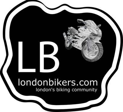
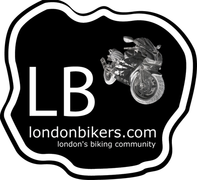
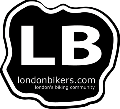
I came up with the following draft recently to put some ideas down, perhaps it can start the ball rolling:
Please help us choose our logo, submissions welcomed!
HEY JAY THERE A BIT PLAIN DON’T YOU THINK OR ARE YOU ON A BUDGET? BUT I WAS THINKING MAYBE A PICTURE OF MAYBY YOUR K5 IN BLACK AND WHITE,IN FRONT OF THE LONDON EYE WITH THE LB LOGO IN THE CENTRE OF IT AND A LONDONBIKERS.COM AT THE BOTTOM.
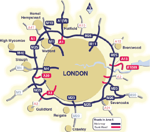
how about something like the nurburgring stickers , you could have the outline of london or the m25 in white with the words londonbikers in white underneath it, all printed onto a black background?
Phil, thanks for the suggestion The image above is just a taster, I knocked it together quickly to start the ball rolling, they’re not intended to be proposed versions.
It’s best to stick to one, or two colours ideally, as that way it’s easy to transfer to print. If more colours are used, then an alternative version with one or two colours should still be possible, i.e. for clothing you might get just one colour to print, the same for many stickers. More colours means much more cost.
Right ok don’t shoot me down too badly this is just a tester as are Jay’s I have been messing around for a few mins and come up with three different versions based on the M25 thing!
I only used my bike in the logo as my other half did a pretty good pencil drawing of it but this could be any kind of illustrated bike.
Don’t say there too rubbish
Ps ignore the poor pixelation on the logo thats just because it has to be small for the web. Please also ignore that the logo has a square white background.
what i was thinking was just to have a thin white line for the outside following the route of the m25 / greater london and just to have london bikers in white underneath.
Cheers mate. I will work on some other verisons over the next couple of days using the same theme with different designs. Great idea though mate credit goes to you.
Thanks mate they look ok but it’s up to Jay I suppose. Not sure it’s gonna be what he is looking for. I can alter the design to many different variations though. Watch this space.
No good fair points Andrew. I am going to work on a london eye version tomorrow night with all the pods on it etc. It will take some time to redraw so look out for late tomorrow eve for updated versions.
Just looked for a map of the m25 the shape is right but no one really knows what shape the m25 is do they so would not recognise it.
Hey nice input guys. Thanks for the effort Yellow. I think the M25 outline is a little ambigious, I didn’t know what it was at first, until I read the post, sorry. The more ideas the better, so please keep them coming. I’ll have another go in a day or two as well.


 I reckon quite smart. Ill have a go tho.