GoF, sorry, it was a very hetic night last night. The logo needs to be scalable, that is, it should be printable on large surfaces, also able to fit into the area on the site we currently have for the logo, so 79x79 pixels. If there’s a good argument for changing this area’s size, then I will of course listen!
Opinions, don’t be offended, its all part of the brain storming…
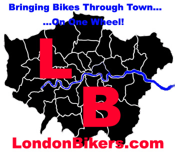
M25 idea, is good, but the shape is not well known, so I went the the map outline of Greater London.
I have stuck to 2-3 colours for each and stuck to the primary colours. I can remove colours and make the fonts double outlined so they can still stand out.
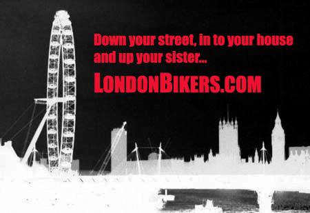
The wording is for display purposes only and can change, hang on, if people are offended by the ‘sister’ one then I will change it…
I have stuck to ‘London’ for this set. Will use Bikes for another set. (bike jumping the thames comes to mind, hehe).
I am also toying with the idea, of not having anything to do with London, and maybe using some funny logos (they sell more t-shirts) and just having the website address underneath.
please give me feedback before I start some more, using a scalable square for a template.
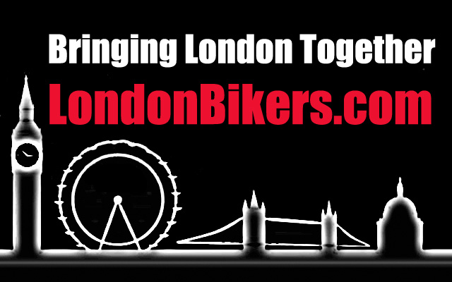
Mate they are brilliant. I especially like the last one on the set of three with he london eye in white blurred effect. Very good. I think we have or designer here. I would like the idea of just focussing on the london idea nice and small with the london bikers words beside it.
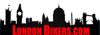
I think the skyline idea is great, but the 4 landmarks could do with a bike shilouette as well, sort of like this, just not so crap . . .

I wish I was able to do half of what you guys are doing… Keep the good ideas coming…
Definately like the “up your sister” one  Not sure its an “everyday” design though, could go on a t-shirt.
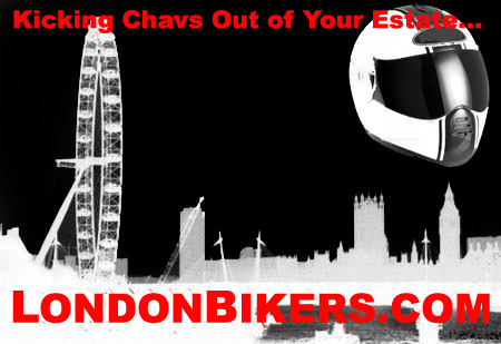
Hrm, the helmet gives me an idea… thanks…
Aw shucks T. Thanks for that vote.
Got bored and found a few momments to try another idea… even though it is kinda treading on the same ideas that we showing…
And yea, I do have a thing for Roof helmets…
Attachments
LOL… like it.
That London skyline silhouette is an absolute must - such an evocative image!
I’m a few days behind on this topic, but I like Jays idea with different bikes on. The one’s with the MX and sports bike. I think it’s displays that the site is open to all types of bikes, etc. the London sky line is a bit “bike safe”. the ideas about the m25 are good but as has been pointed out nobody would recognise it. The idea of the thames is a good idea.
That’s my 2p.
I’ve asked a mate, who is a designer to take a look at this thead. They might come back with some good ideas.
Should be working, but hey…
![]()
Piccadily Circus in exchange for london bikers, lol ![]()
-Hennessy
I like the tube map idea, what if the lines where tyre tracks and in the shape of LB within the map.
Good ideas!
these are top notch… will contrib something better soon , given some time .
Excuse the obvious

I think you guy’s have all come up with some v good idea’s. I still like the M25 logo, GOF’s silloette of London’s attractions is cool as is Lcaller’s tube logo.
Keep up the good work fellas!
