


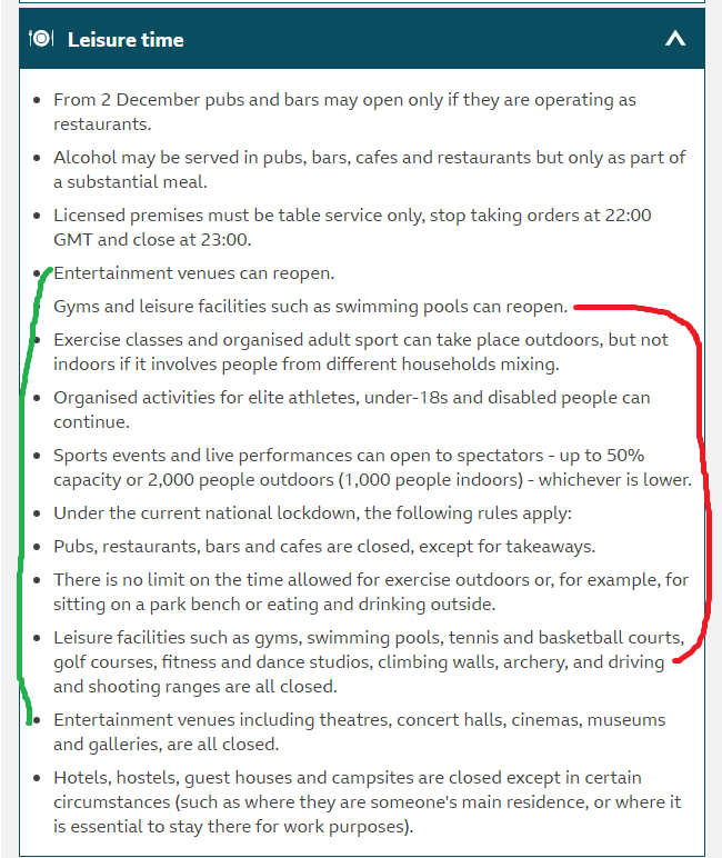
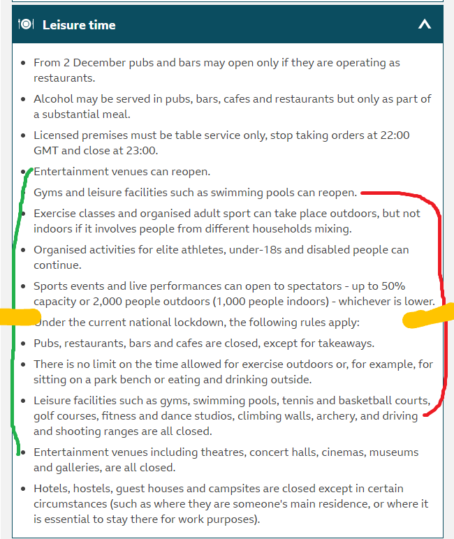
I was trying to check the new restrictions, but apparently a bunch of stuff written contradicts itself. Just as an example:
1 Like
Are you expecting anything else from a government that is so inept, incompetent, and corrupt that they have utterly destroy political satire?
3 Likes
Its all here >>> The Health Protection (Coronavirus, Restrictions) (England) (No. 4) Regulations 2020
2 Likes
Oh, I see, there is a statement there, which looks exactly the same as the rest of the listed items, that I missed. That is the stupidest way to present information I’ve seen in a while.
1 Like
Do agree that it is a bit piss poor
It’s almost as if those in Gov are lacking incredible basic word processing and presentation skills. Not breaking that list up with a header and ditching the bullet point is the work of a complete numpty. As bad as all the powerpoints we see their briefings with badly cut’n’paste charts with all the crucial scales, numbers and keys obscured from view off the edges. And some of it has just been plain misleading, like colour coded maps of cases between counties, where the before and after have scales on the keys changed so the colours look similar…
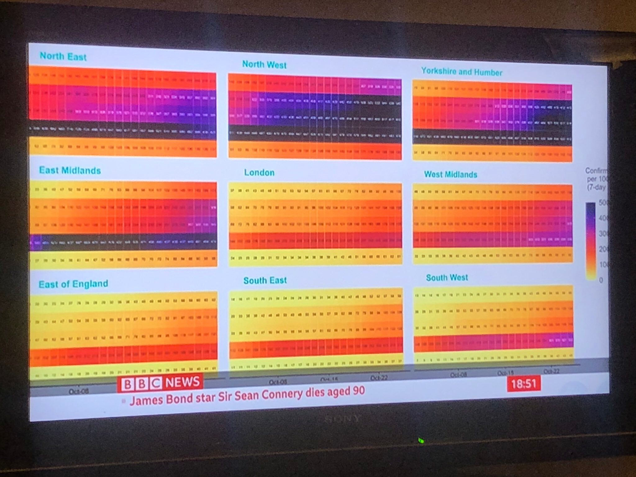
Also, I mean how does the average public interpret this shit:
1 Like
Despite what some say, the BBC are not part of the government.
Slacker clearly said they were quoting the BBC. It is not even a copy and paste of the government information but their own journalism.
And broadcasters are responsible for inserting the slides into the press conference broadcasts. The mistake in your BBC One screenshot was also made by the BBC. Had you watched it on Sky News or the government’s YouTube feed you would have seen the full slide.
Finally, it is quite normal to change the scale when presenting data otherwise you end up with a map of solid colour, or a lack of contrast int he gradations. The government — to the best of my knowledge, and being high risk I have followed a lot of this stuff — has never presented two maps with different scales for comparison. They are intended to show a comparison between authority areas, not over time.
The government is awful at almost everything, but that is not excuse for those criticizing them being equally as sloppy. I found the fall out over that heat map being shown off the edges of the screen quite confusing. I did not watch it on the BBC so saw the full slide as it was supposed to be seen.
Yet despite a lot of journalists and high profile critics attacking the government for it, I did not see a single correction from any of them. I doubt any of them even did any sort of cursory journalism to even know it was the BBC at fault.
I guess we get the government we deserve.
2 Likes
Easy mate, states clearly the beloved Sean Connery has died!
As long as you can take road sport to achieve continued good mental health outcomes