After receiving some feedback that I agreed with today from a long-time member (@afro), I’ve changed the homepage so it shows the category list and the latest posts, rather than just displaying a long list of new posts.
The rationale, or feedback was that new members coming to the site wouldn’t be able to easily ascertain what the breadth of discussion is across the community. It’s all well and good seeing 30 or so of the latest posts, but that doesn’t do a good job of letting new members know that we have sections dedicated to help & advice, classified ads, ride-outs, racing, etc.
Hopefully this makes it clearer to prospective/new (and existing, who may have forgotten!) members what exactly LB has on offer - which is a rich 18 year history of posts across all the different aspects of biking. There’s a wealth of advice available in there (which hopefully the new search feature makes a lot easier to find!)
Sorry if some folks find this a little jarring. We’re still finding out way with the new forum, though I’m stoked that we have so much room for customisation.
Yeah, that doesn’t seem quite as intuitive to me. I think the category view for desktop works really well, but on mobile perhaps it should just be the latest posts, though there doesn’t seem to be a way to set difference options for desktop and mobile
We’re not using custom forum software anymore, so can’t do anything custom like that. I’m looking into ways it can be done using the software we have. Others have requested it and someone claims to have a work-around. We’ll see. For now I’ll change it back to Latest Posts.
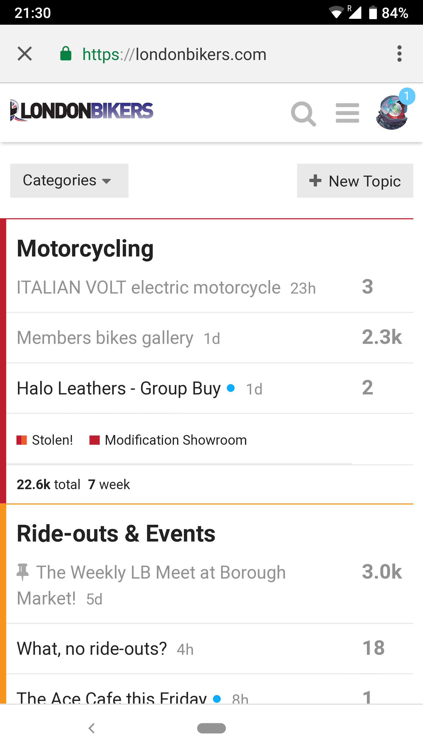
Okay, found a plugin that made it possible for us to have different homepages for mobile and desktop.
Desktop now shows the categories view and mobile shows the latest posts view. I think these are the best choices for these platforms - i.e. desktop users can now see all the different categories we have and thus the breadth of discussion, and mobile users with their small screens can just see the latest posts.
Briefly experienced the previous version of the site so not as familiar with as the other regulars. This new format looks great though and easy to navigate so far!


 to me Jay.