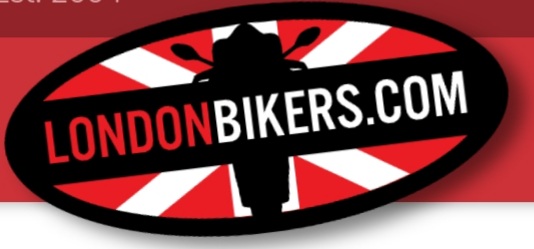
The keen eyed amongst you may have noticed that we’ve changed our branding. The longer-serving amongst you should also recognise the logo and colour scheme - it’s a re-mastered version of the logo we ran for many years, and one that LB is probably most well known for.
Why have we done this? - A number of reasons really, not least is that we didn’t really like the old logo. It was given to us when LB was under a caretaker stewardship (I stepped down for a bit, I had a lot going on in life at the time) and we didn’t have any proof of usage rights, so couldn’t use it with any great degree of confidence on prints, stickers, keyfobs, promotions, etc.
We tried for a few years recently to come up with a new logo of our own, and even contracted a number of graphic designers, but struggled to land on an identity that worked; something that represented what LB is. After some deep and meaningful conversions, we decided that it was a folly to try and re-imagine LB. It is what it is, it’s got a rich history and shouldn’t be ashamed to lean on that. People with more experience in branding matters have assured me that we’re not the first brand to revert to a previous logo.
Hopefully you like it.
It means we can get stickers made up again at long last if nothing else
Now, if you’re feeling nostalgic, here’s how the site used to look over the years…