


not a huge fan of the gixxer white&blue colors but this looks good!
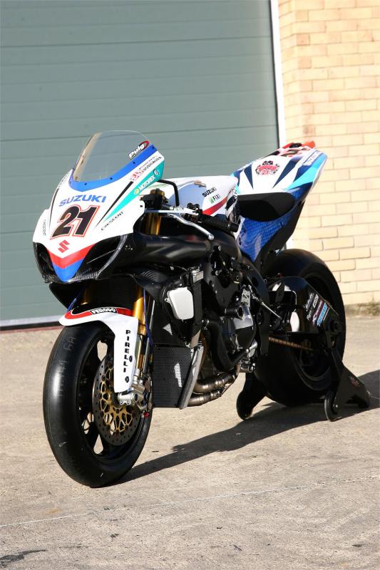
more info here
http://londonbikers.com/news/24965/crescent-fixi-suzuki-unveils-wsb-gsx-r1000
not a huge fan of the gixxer white&blue colors but this looks good!
more info here
http://londonbikers.com/news/24965/crescent-fixi-suzuki-unveils-wsb-gsx-r1000
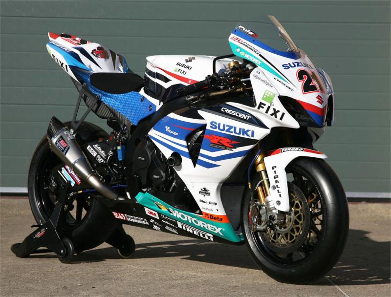
I’d rather have the blue and white than look like a billboard on wheels any day! He has more stickers on his bike than yo-yo and thats saying something.
Why is it the dudes responsible for designing bike colour schemes always want to throw in some shonky pastel colour… ok so red blue black white and yellow are quite popular but what the hell is with the 1980’s GErman greens or purples, or baby blues, … it just makes an awesome bike look like some repressed teenie goth has got bored of black, got out his sisters paint pallet and thought yeah… pastel pink and metallic Green really do go beautifully with **** brown and fluorescent orange… why has no one thoguht of this before…
IT LOOKS PANTS!
I think it looks nice 
have you seen the hat in your profile pic? ![]()
yeah but that was made out of recycled plastic bags… its supposed to look pants… name one racer who says to his design team,
“Make me look like a German 80’s chav tastic acid casualty… that’ll really get the fans onboard”
Your hat looks like Mike Edwards’ world famous one…but without the prestige ofcourse ![]()
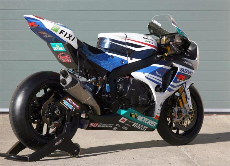
Thats because its a 2012 World Superbike and has to have the team sponsors on it ![]()
Its Hoppers bike dude
i LOVE it and normally hate GSXRs
Don’t they usually make a road version of it? I hope they don’t.
I mean with that horrible colour scheme…
You sometimes get a race rep version , or you can have it custom made.
Its having Motorex as a sponsor thats making it look odd IMHO , without the pastel green its nice.
It might be that. I just think its too busy, if that makes sense.
I like it!
The words Helicopter and Crash spring to mind :Whistling:
Graphics by Stevie Wonder I guess;)